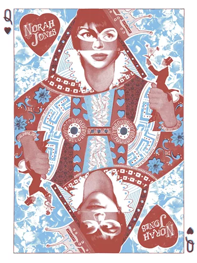
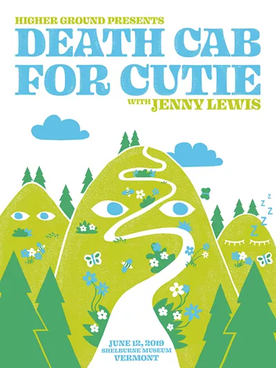
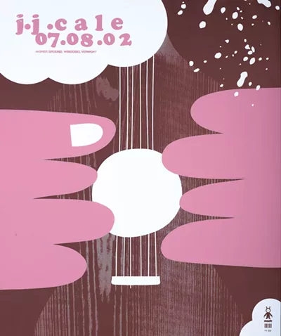
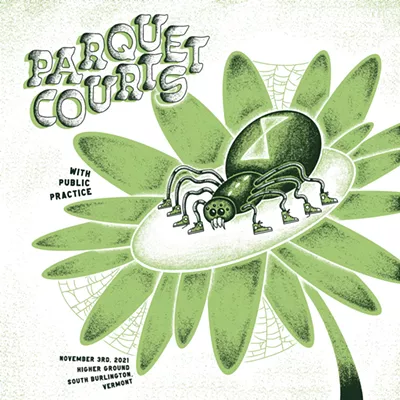
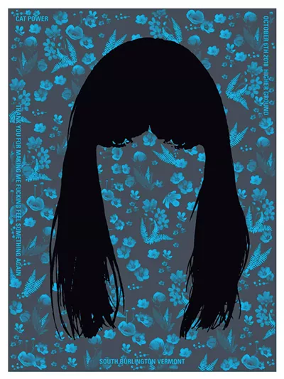
Cat Power. Phish. Yo La Tengo. Death Cab for Cutie. These bands aren’t typically associated with museums. But they’re among the names on 270 works of art in a new exhibition titled “Sound, Art & Ink: Higher Ground Gig Posters” at the Shelburne Museum. And if the art itself doesn’t actually make any sound, the graphic designs nearly leap off the walls.
South Burlington nightclub Higher Ground first opened in Winooski in 1998. Two years later, its owners began handing out free show posters to concertgoers — providing they stayed until the end of the show. But the posters aren’t cheap, mass-produced souvenirs; they are limited-edition screen prints designed by artists and made by hand at Burlington’s Iskra Print Collective.
Affiliated with branding and design studio Solidarity of Unbridled Labour (previously Jager Di Paola Kemp), the nonprofit, all-volunteer studio is open to the public and offers occasional screen-printing classes.
Solidarity and Iskra artists have designed more than 300 posters for Higher Ground acts over the years. In 2023, Higher Ground co-owner Alex Crothers and a Solidarity team led by founder Michael Jager collaborated on a 25th anniversary book featuring the posters: ECHO: A Survey at 25 Years of Sounds, Art and Ink on Paper. Now most of them can be viewed at full size in the Colgate Gallery of the museum’s Pizzagalli Center for Art and Education.
The exhibit itself is like a big party celebrating the nightclub, design studio and printing center collaboration, which is ongoing. The organizing principle is color, with posters grouped according to their dominant hue. A soundtrack of 12 playlists was curated by Guster lead singer Ryan Miller, jazz trumpeter and band leader Ray Vega, the Vermont Symphony Orchestra and others. (Accessed via a QR code, the music is meant to be heard on headphones so as not to drive the docents crazy.)
For extra fun, museum curators Kory Rogers and Carolyn Bauer created a visual scavenger hunt on the back of their detailed exhibition booklet. Each clue is presented as a rhymed poem.
Iskra gets its own corner of the show with a display of screen-printing tools and a useful how-to. A long table adjacent to the mural-size photo of a mixing board lists every Higher Ground show and its date in minuscule type. A new poster commemorating the exhibition by Solidarity designer Byron O’Neill , featuring a grid of eyes taken from nine gig posters, is for sale in the gift store, along with the commemorative book.
That striking publication caught the eyes of both Shelburne Museum director Tom Denenberg and Rogers, who is the Francie and John Downing Senior Curator of American Art. Rogers perused it in his husband’s car — Jonathan Mikulak was then a creative director at Solidarity — and realized it needed to be an exhibition, he said during a recent tour. Thank goodness: The book is beautifully done, but photos of the posters can’t fully convey the scale, staggering range of color and creative detail of the physical objects.
The curatorial team honored that physicality by hanging the posters with magnets (thereby avoiding 270 framing jobs), but, unusually, they didn’t choose the posters or how to organize them. Crothers devised the latter aspect of the show. He said he considered presenting the works chronologically, as the book does, but “had an epiphany one day” to do it chromatically.
“My fundamental operating procedure is, when people come in the door, you want to engage them with something fun and dynamic,” he explained.
Crothers, Jager and their teams chose to include nearly all of the book’s posters plus another 20 made since then. The show represents a team effort that included Iskra artists Brendan Lynch, Jasmine Parsia and Leo Listi, facilitated by museum exhibitions coordinator Kate Owen.
“There was some talk about making it more focused, but I think it wanted to be a ‘more is more’ situation,” Crothers recalled. “Some are amazing designs; others are about artists who played here, like the Lumineers, that have since blown up into stadium-level bands.”
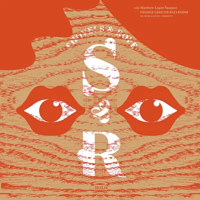
“Sound, Art & Ink” presents the work of 88 visual artists. The posters come in a handful of formats, but the most common is 15 inches square, in honor of LP sleeves. Among their eye-catching designs is O’Neill’s in red and tan for Shovels & Rope’s appearance in 2016. It suggests a face with two eyes set inside open mouths on a “skin” of wood grain, made by scanning a piece of wood veneer.
Other material surprises include metal-flaked paint in a 2011 poster for Iron & Wine by Erik van Hauer and the silver background of John Siddle’s poster for Interpol’s 2003 concert; Siddle hand-sprayed each of the 250 posters in that run. Even more laboriously, designer George Mench machine-stitched a line of thread across all 146 posters he made for Ray LaMontagne’s 2005 appearance, in honor of the musician’s former job in a shoe factory.
The designers and printers are “always looking to push the art, be experimental,” Jager noted during an opening talk at the museum.
Stark forms in bold colors characterize Erik Petersen’s black-background poster for Busta Rhymes’ 2008 concert, depicting only the white teeth, red tongue and blacker gullet of a shouting mouth. Similarly, Todd Wender’s whimsical Ween poster from the band’s 1999 show spells out its name in a puddle of pee in which two pink, slightly knock-kneed legs stand barefoot.
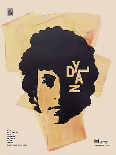
Jager’s design for Bob Dylan’s 2017 concert is iconic, befitting the singer: He brushed each of the edition’s 300 posters with a unique swath of color and printed Dylan’s young, shadowed face on top in black.
Dylan performed as part of the Ben & Jerry’s Concerts on the Green at the museum, presented by Higher Ground. That collaboration, which began in 2002, is honored with a separate wall of 10 posters made for the outdoor concerts. (This year’s series ticket holders can get half-price entry to the museum.) Concerts on the Green rarely get a poster, Crothers noted, because the possibility of rain and the grounds’ capacity for up to 3,200 concertgoers make limited-edition paper gifts impractical.
The unpredictability of which concerts will get a poster is always on the minds of people known as “patient piranhas,” according to Rogers — a subculture of Higher Ground fans who troll underground sources to make sure they snag every poster.
Crothers said selecting a concert for the honor is a question of “alchemy.” He sends the list of the next few months’ shows to Solidarity, sometimes flagging artists who are sure to sell out or, conversely, unknown but likely to someday make it big. (“You get a little bit of a nose for that,” he said.) At other times, someone on the Solidarity team might be “super plugged-in to music” of specific bands.
“The philosophy underlying the letter still exists: This just needs to be fun,” Crothers said. He was referring to the letter he wrote to Jager in 1998 proposing the poster collaboration; a reproduction hangs on one wall in the gallery. After all, Crothers added, “[The designers] do it on the side as a hobby. No one’s making any money.”
“Sound, Art & Ink” is not just a “testament to the power and draw of Higher Ground,” as Rogers put it. It’s also an affirmation of the concept of art for all and a welcome reprieve from capitalism’s hold on both art and music.

